Evelina Mohei is a graphic designer based in Stockholm, SWE.
She is interested in design as vessels for stories—the ones often overlooked and at risk of being forgotten.
| Mail |
evelinamohei (a) hotmail . com |
| Instagram |
evelinaloca |
| Address |
Hägerstensåsens medborgarhus |
| |
Riksdalervägen 2 |
| |
129 32 Hägersten |
(Selected) works
![bild]()
![bild]()
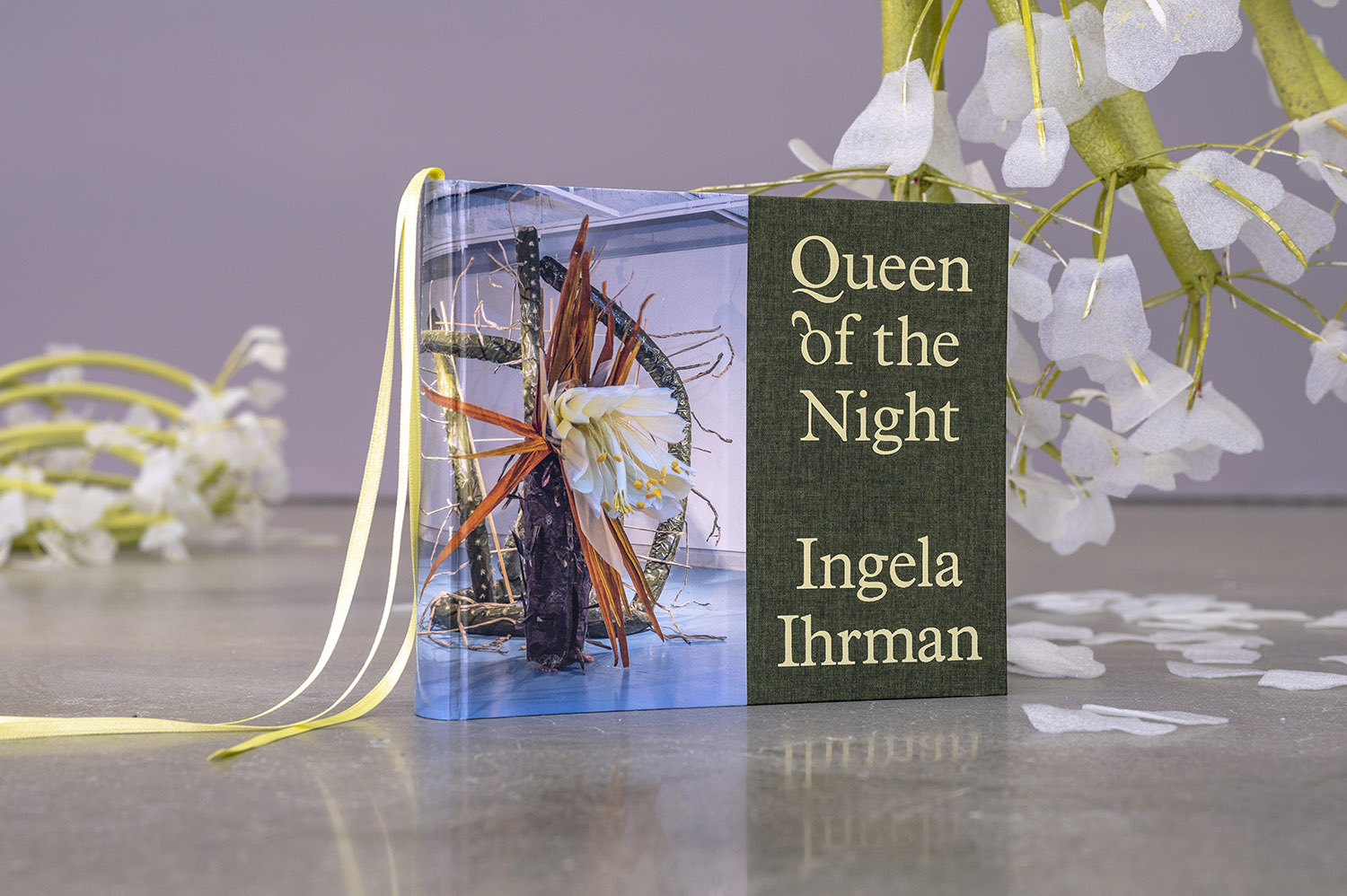
Ingela Ihrman, Queen of the Night
Book design for artist Ingela Ihrman’s first monograph, featuring works spanning 20 years of her artistic practice.
The title refers to the cactus flower “Queen of the Night,” which blooms for one single night each year.
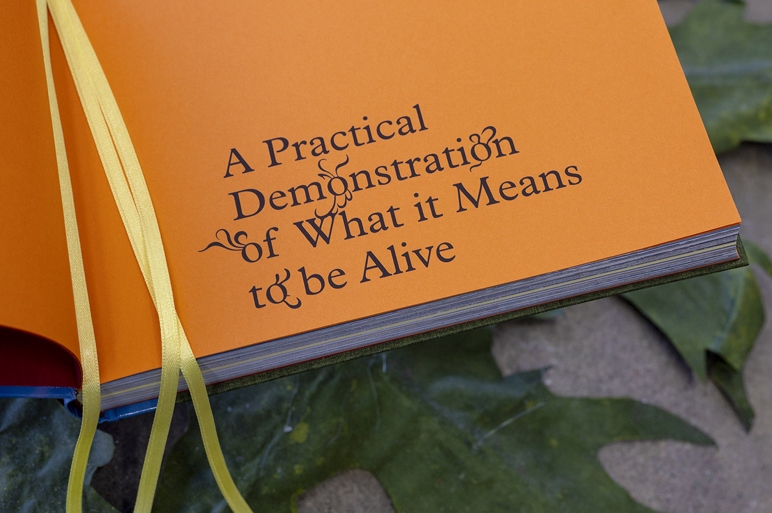
The book’s form was inspired by the flower, with the cloth on the cover representing the cactus’s rough, branching arms while the inlay of the book takes the shape of the flower: colored paper represents the dark red and orange outer petals, while the majority of the pages are white, carrying texts and images of Ingela’s work. At the center, a yellow section holds three ribbon markers representing the flower’s pistils.
The typeface is a modified version of Plantin, in which all lowercase “o”s in the headings have been transformed into flower buds, each decorated with small petals.
Published by Bonniers Konsthall
Distrbuted by Mousse Publishing
Editor: Caroline Malmström
Print: Livonia
Prepress: Printpool
In the background of the photo Ingela Ihrman’s solo exhibition at Bonniers Konsthall, Nocturnal Games, is visible. The artwork seen is The Giant Hogweed, 2015.
![bild]()
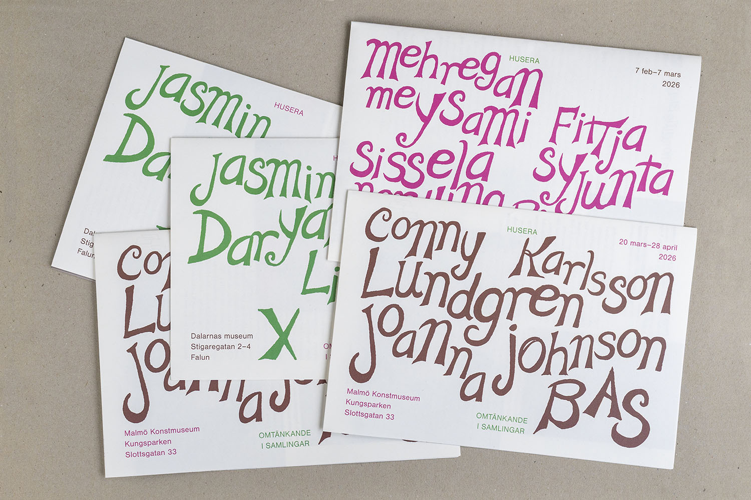
Housing a Critical Re-Thinking Within the Collections
Graphic design for a project exploring how to collect, and how graphic print collections can be engaged with today. As part of the visual identity, the typeface Dual Unionist by the Justseeds collective is used. A work that takes archival material from North American labor movements and resonates it. The letterforms expand, contract, adapt to surrounding space, or assert themselves across it.
In 2027, we will be working on a publication about the project.
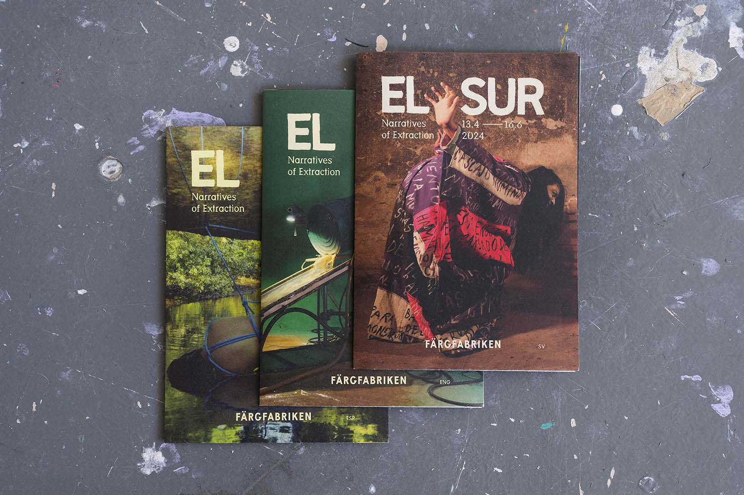
The image shows brochures from the three exhibitions that formed part of the project.
![bild]()
![bild]()
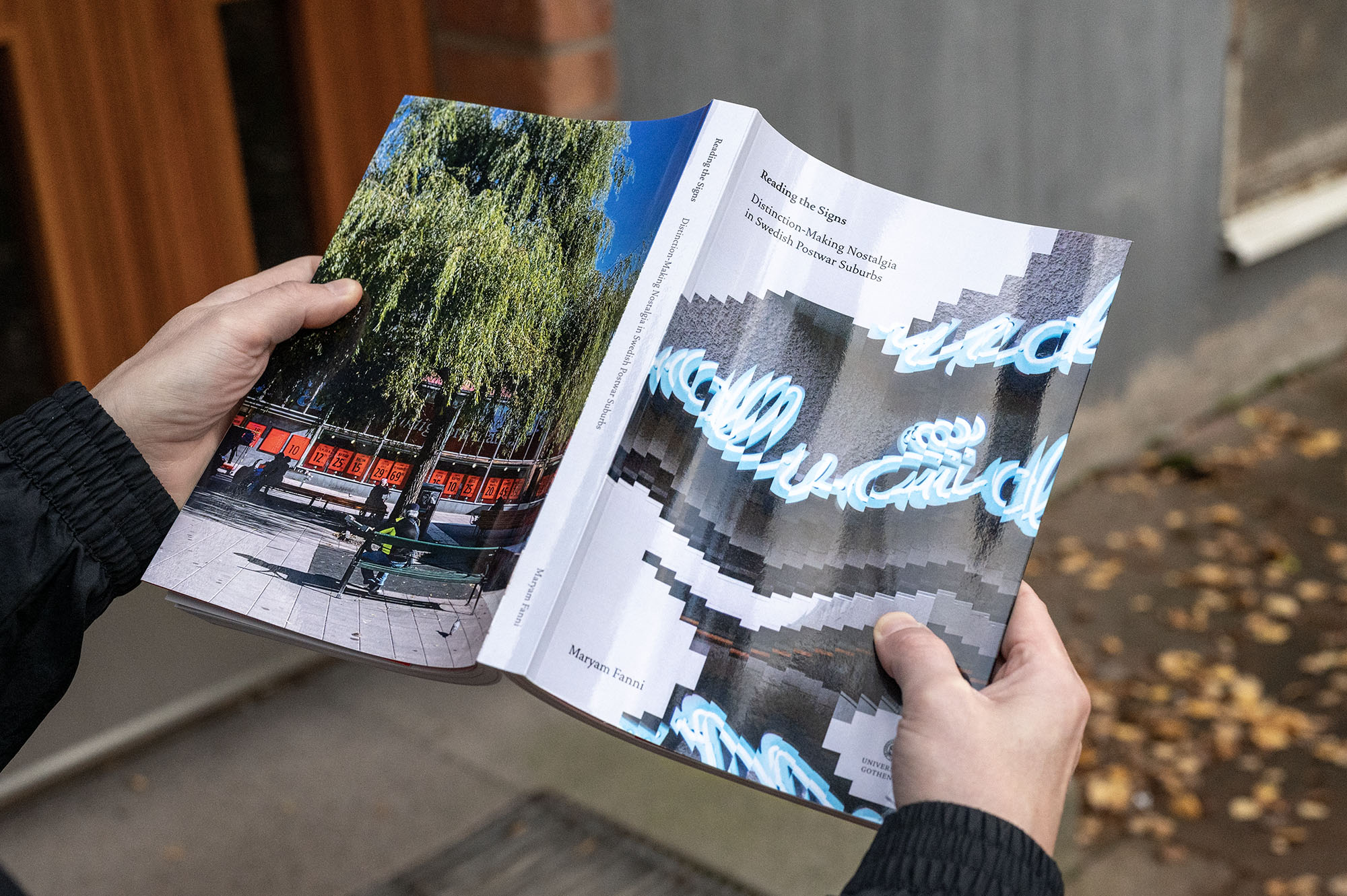
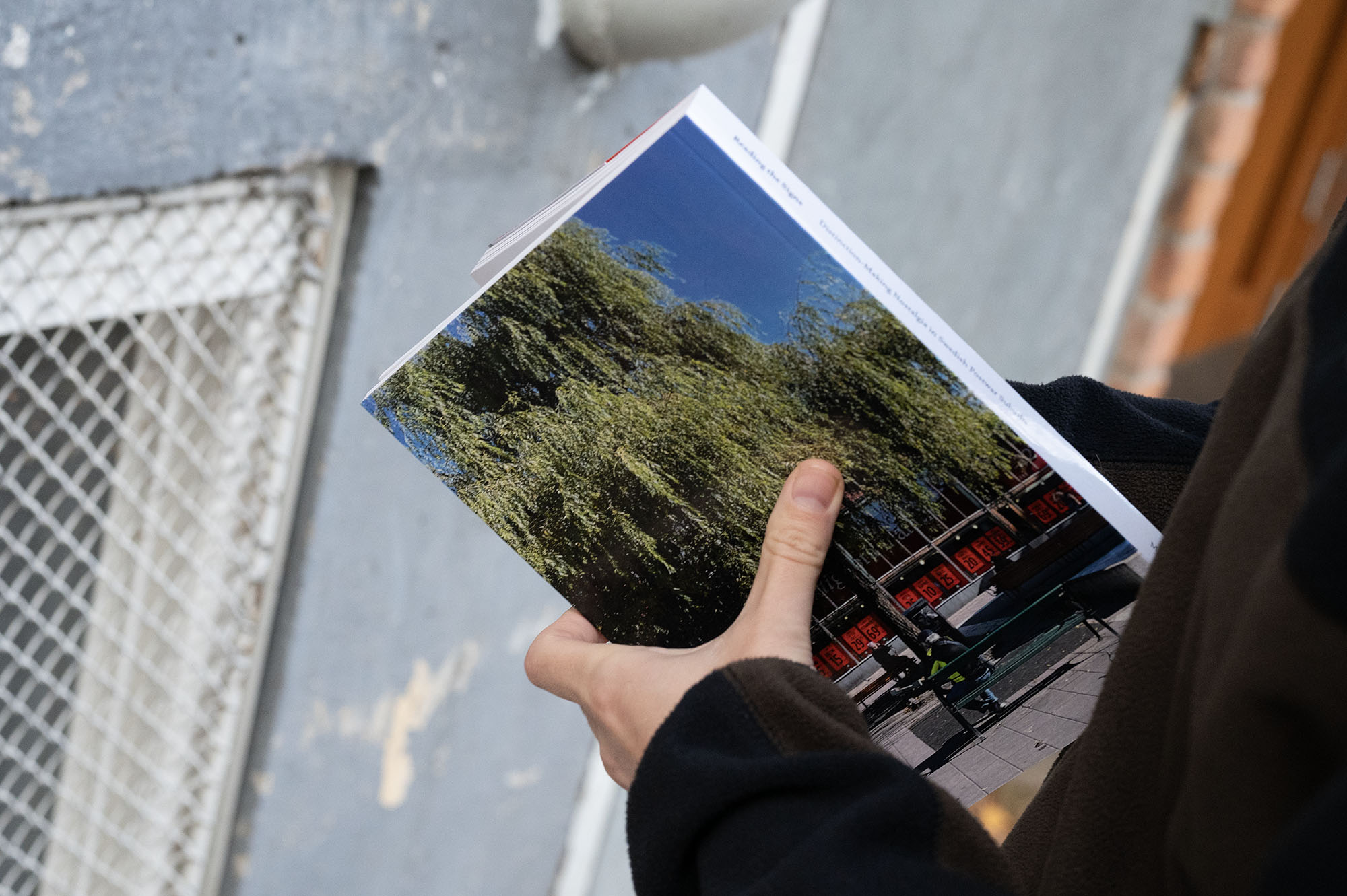
Reading the Signs—Distinction-Making Nostalgia in Swedish Postwar Suburbs
Book design for graphic designer and researcher Maryam Fannis dissertation.
The choise of type corresponds to themes as memory loss, deja-vu and problems one might encounter while approaching the past.
The cover image is a shredded photo of a newly produced neon sign in the Stockholm suburb of Hökarängen, arranged in a way that makes the image move both forward and back simultaneously and makes the text of the sign impossible to read.
![bild]()
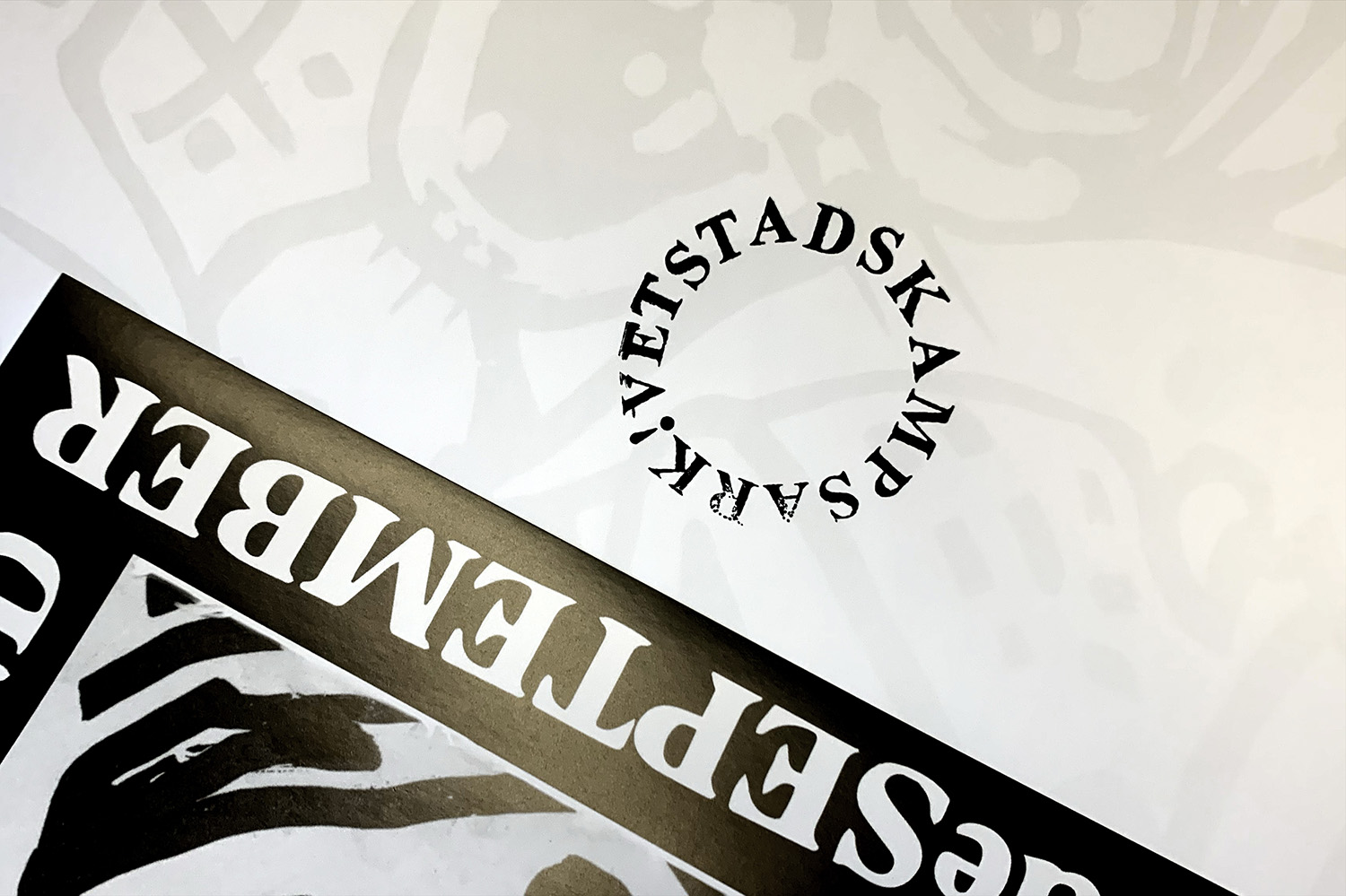
Stadskampsarkivet (The Right to the City-archive)
Logotype, stamps and adaptation of the Times New Roman font for Stadskampsarkivet that collects, reprints and distributes graphic material from demonstrations and urban political campaigns from the Swedish ”right to the city”-movement.
![bild]()
![bild]()
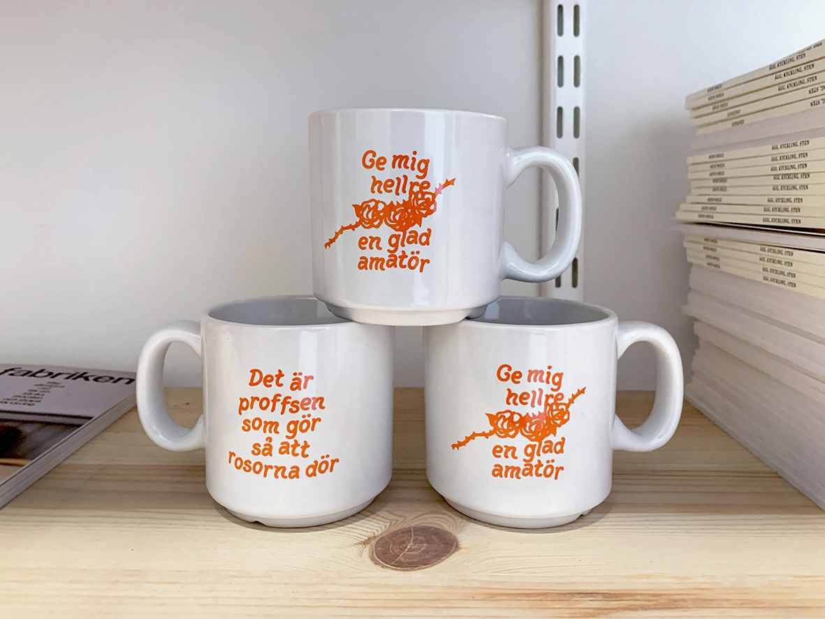
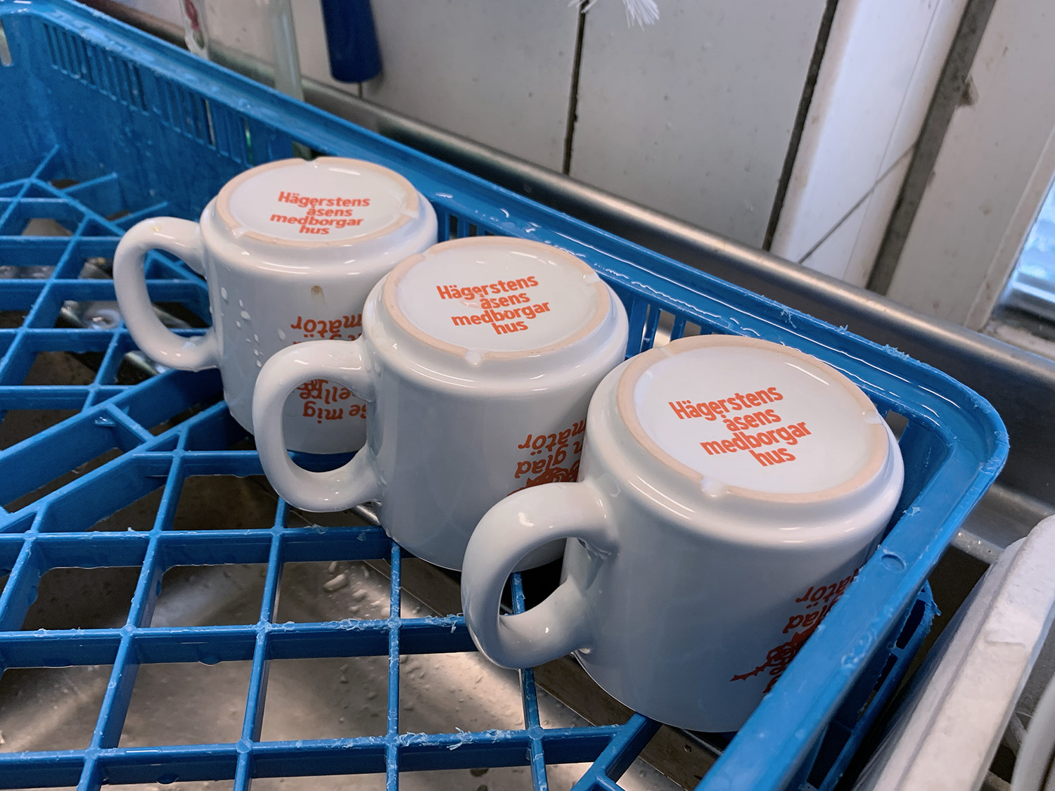
Coffee cups for Hägerstensåsens medborgarhus
Coffee cups printed with a quote from Swedish writer Tage Danielsson, a rhyme that celebrates the amateur. On the bottom of the cup there is a print with the hose logotype which is visibly by the one sitting in front of you while drinking from the cup.
![bild]()
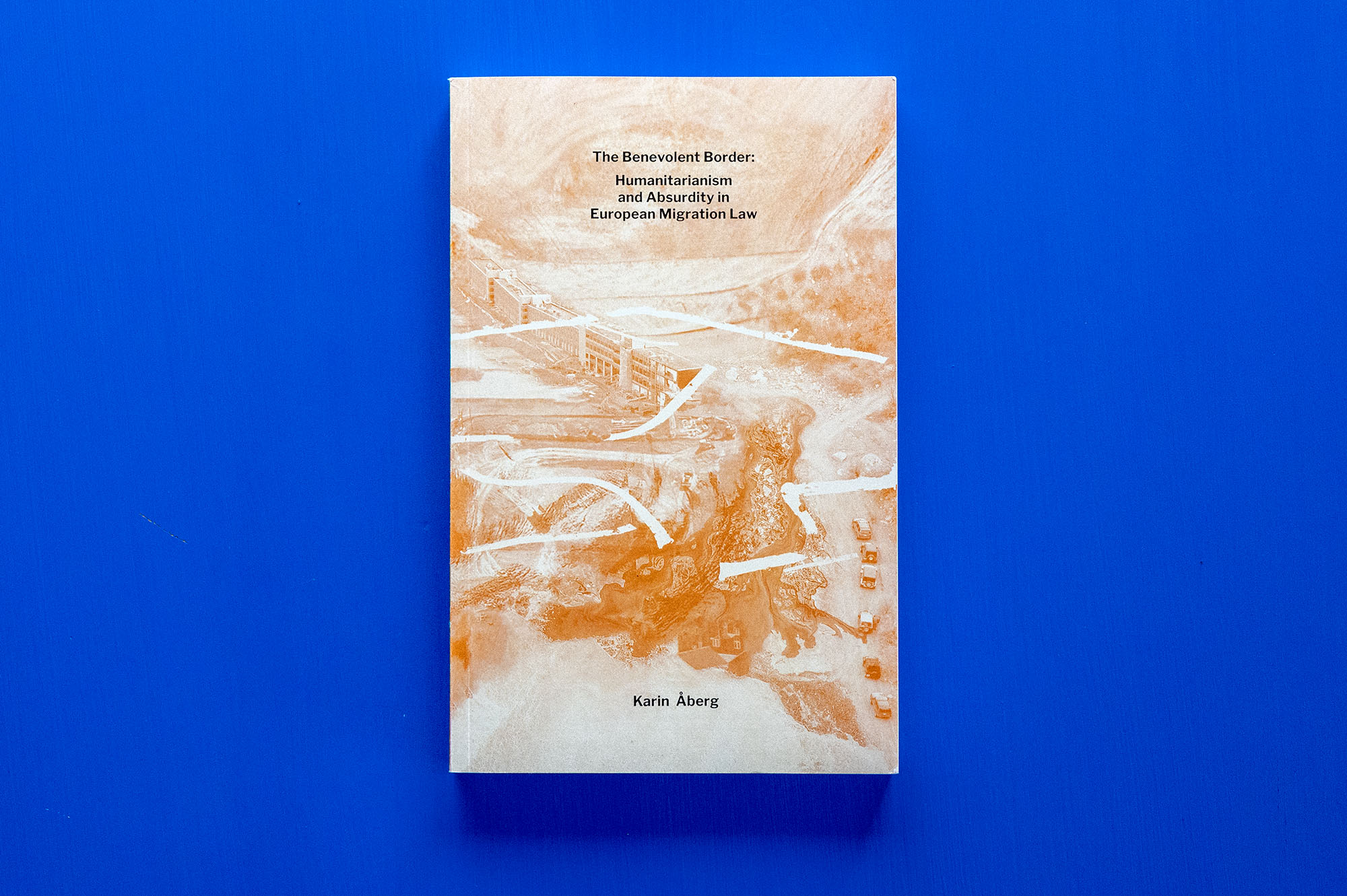
The Benevolent Border—Humanitarianism and Absurdity in European Migration Law
Book design for law researcher Karin Åbergs dissertation on the absurdity of borders. The cover photo is a collage with uneven, unclear, indistinct, inverted and impossible borders.
![bild]()
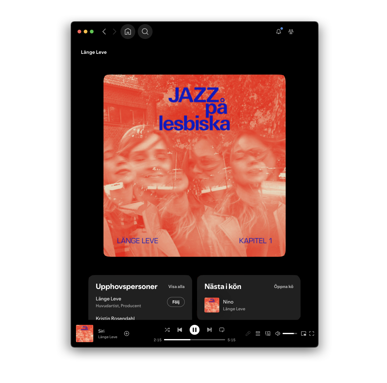
Jazz på Lesbiska — Kapitel 1
Digital record cover for lesbian jazz group Länge Leve's Jazz på Lesbiska — Kapitel 1.
![bild]()
![bild]()
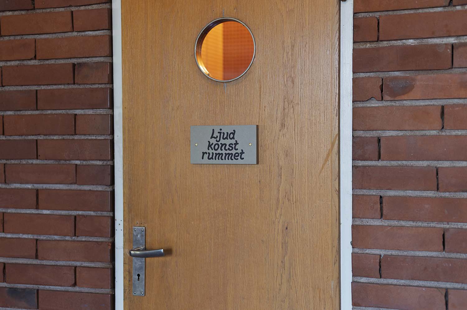
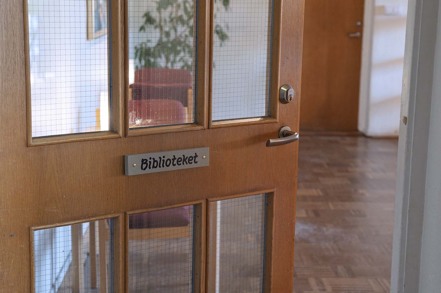
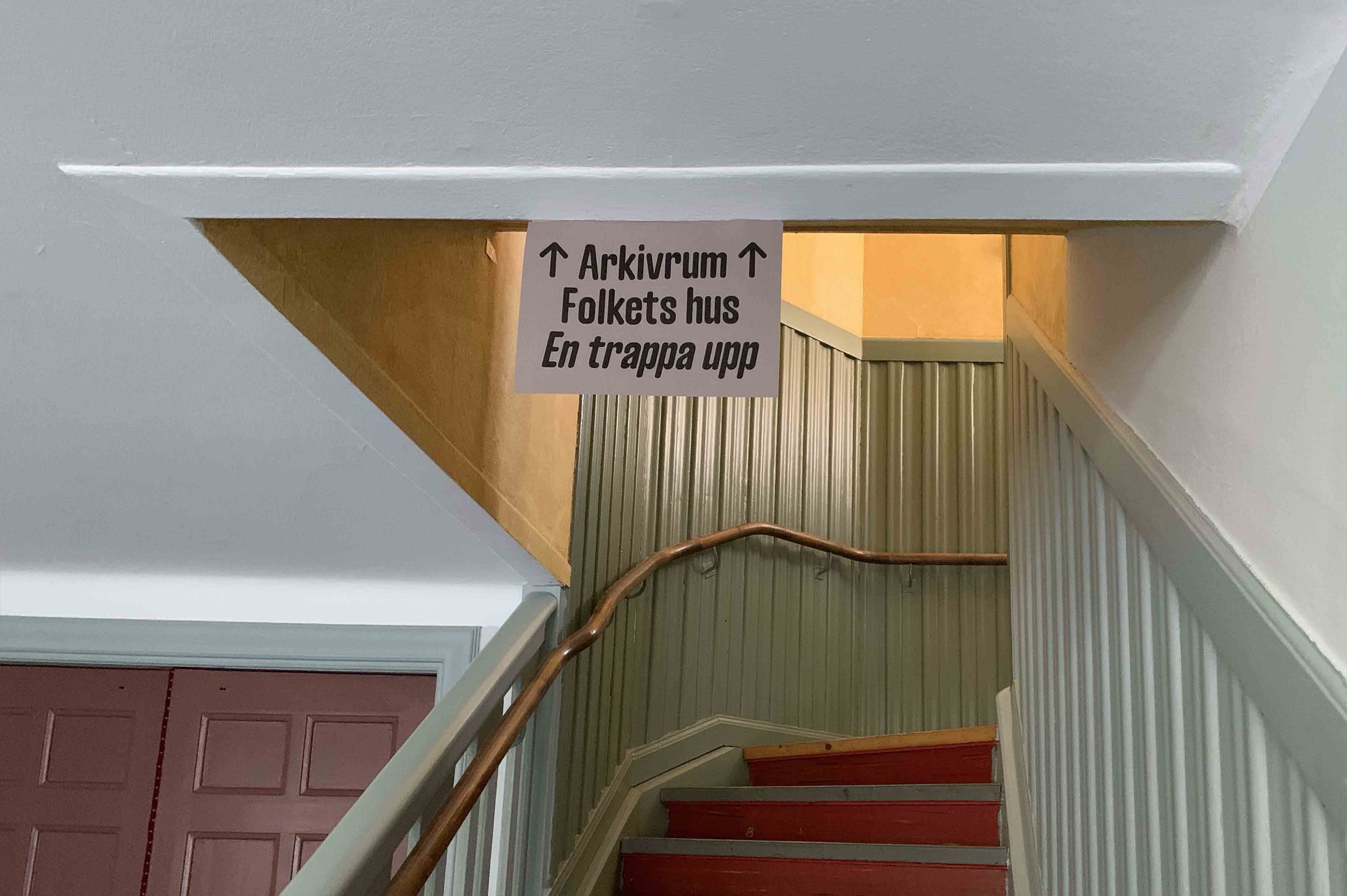
Complementary signage system for Hägerstensåsens medborgarhus
The signs work as a complement to the already existing signage system with hand made wooden signs. The systems co-exist and assists the visitors in finding their way.
![bild]()
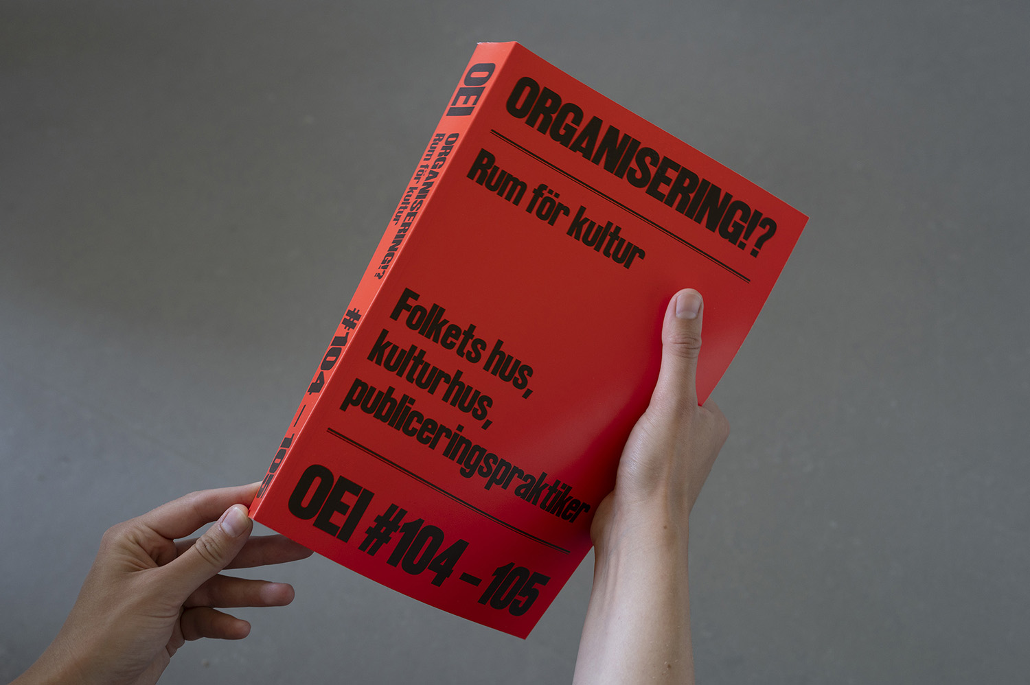
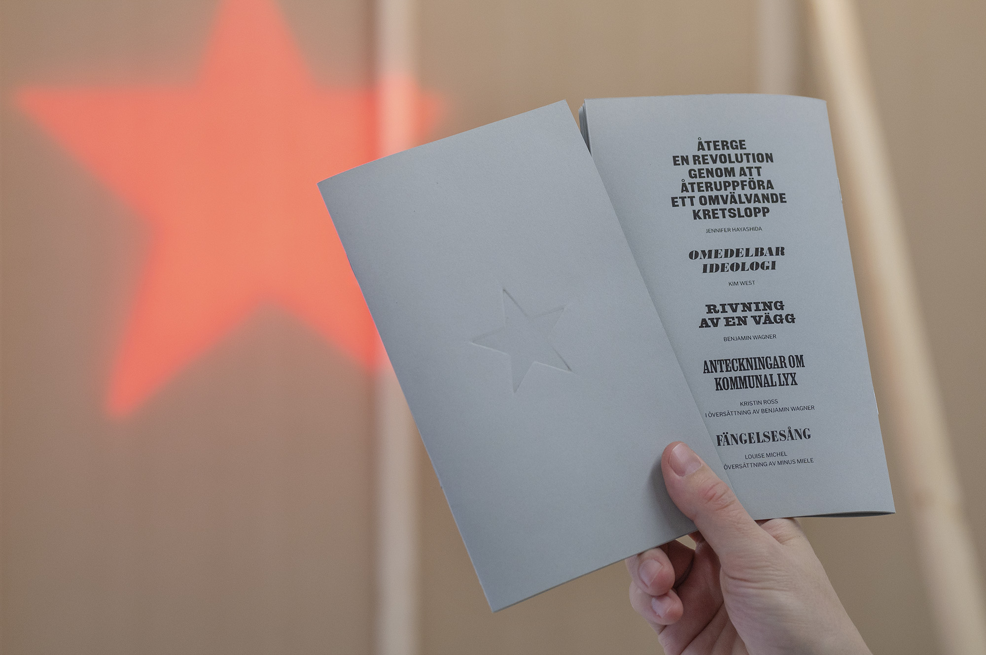
OEI #104–105: Organisering!?
Rum för kultur: Folkets hus, kulturhus, publiceringspraktiker
Design and layout of OEI #104-105, on organizing, social centers and publishing practices.
The heading fonts are made out of wooden type and are collectively digitalized by the project XCicero.
Similar wooden types has been used in printed material by the people’s house and workers movement.
In this issue I have also contributed with a text about an ongoing project with finding the person that hand carved the wooden signs at Hägerstensåsens medborgarhus.
![bild]()
A Grin Without a Cat
Riso printed publication with hand made imprint for group exhibition A Grin Without a Cat, curated by Lina Lundquist and Sebastian Dahlqvist at Hägerstensåsens medborgarhus.
Seen in the background: Alex Valiljani, The Sign Works its Terrible Magic, 2025
![bild]()
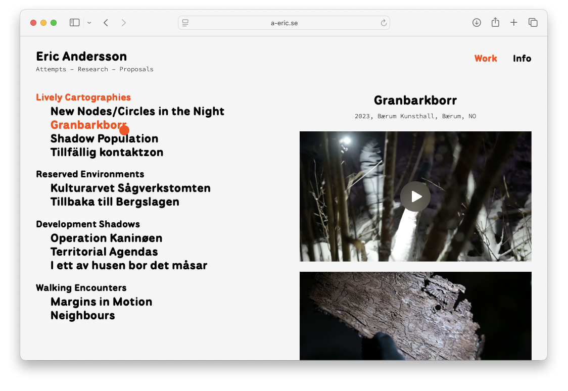
a-eric.se
Web design and programming for artist and architect Eric Andersson, where the cursor is ”a red ”you are here”-marker Visit the page at a-eric.se.
![bild]()
![bild]()
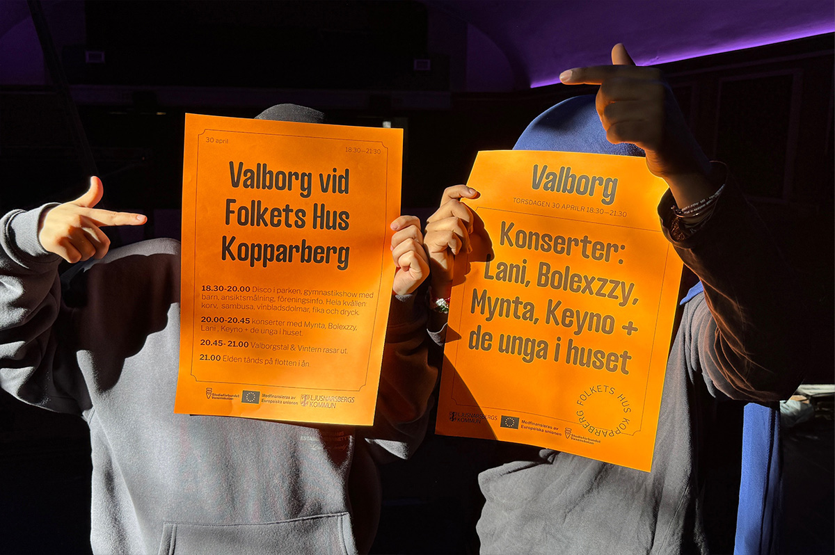
Folkets Hus Kopparberg
An ongoing project with the graphic profile for a social center in Kopparberg, Sweden.
![bild]()
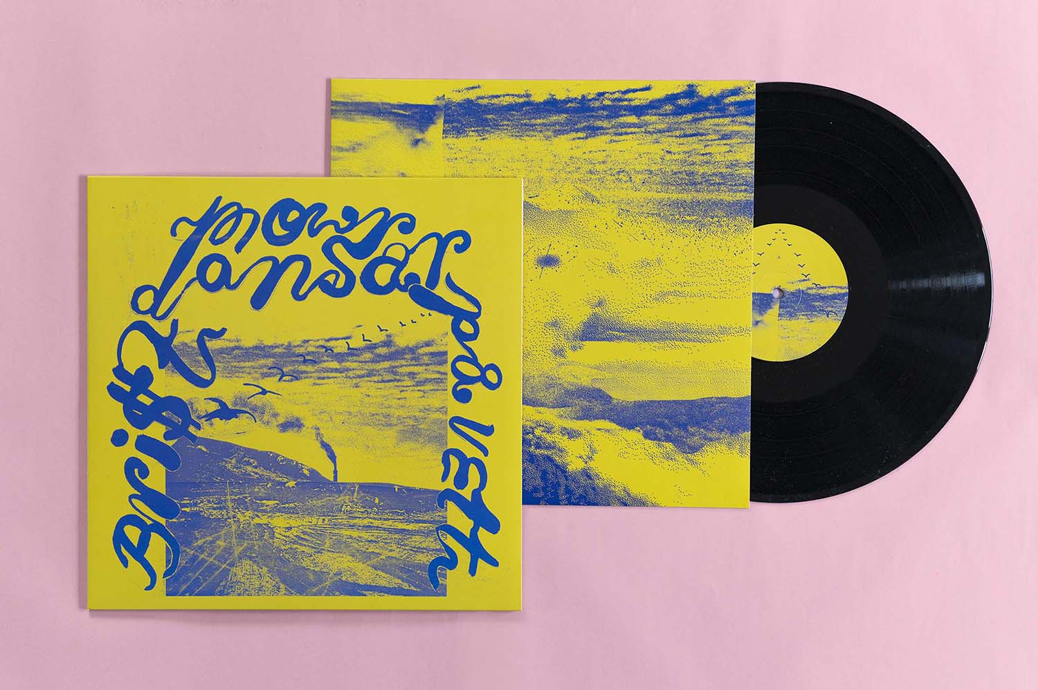
Mor Dansar – Brist på vett
Album artwork for the folk band Mor Dansar, who on Brist på vett interpret songs by Allan Edwall that explore life’s big and small questions.
![bild]()
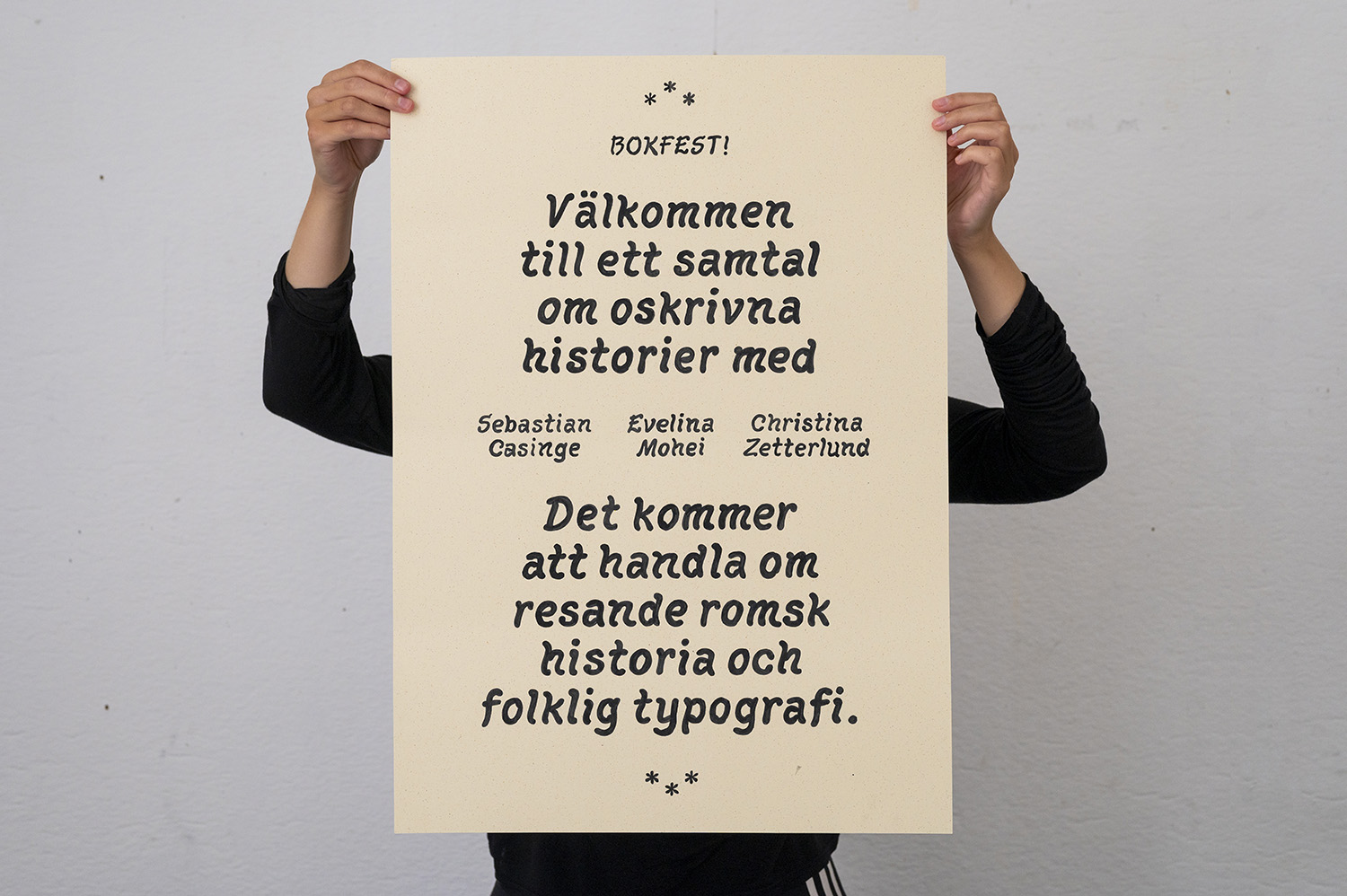
Bokfest!
Hand painted poster with typography inspired by hand carved wooden signs at Hägerstensåsens medborgarhus, for a release party for two books on local design stories with a following panel discussion. Exploratory study for typeface. Ink on speckled paper, Gmund Lager 250 gsm.
![bild]()
![bild]()
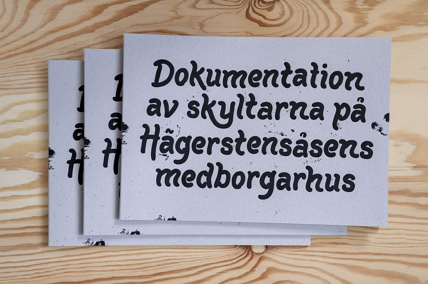
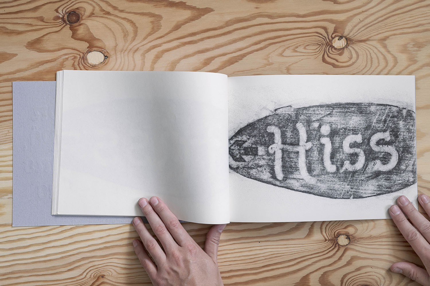
Documentation of the Signage System at Hägerstensåsens Medborgarhus
A collection of graphite rubbings made as research in a typeface project.
The rubbings are collected in this hand bound publication. The inlay is riso printed while the cover is letterpress printed by Norrbacka tryckeri. Edition of 50, published by Förlaget damm.
![bild]()
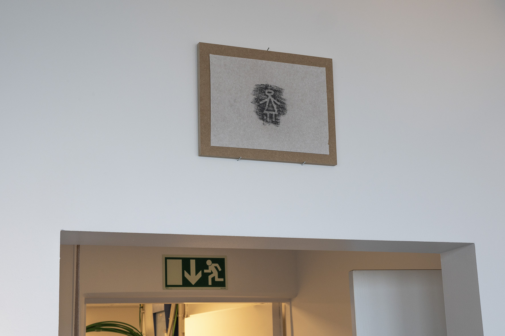
Self portrait
Graphite rubbings from my research in the hand carved signage system at Hägerstensåsens medborgarhus. Exhibition view: Daily Views DN-scraper, Stockholm.
![bild]()
El Sur: Narratives of Extraction
Graphic design for El Sur, a group exhibition on the darker side of extraction, focusing on southern South America, at Färgfabriken konsthall in Stockholm.
Curated by Victoria McCarthy.
![bild]()
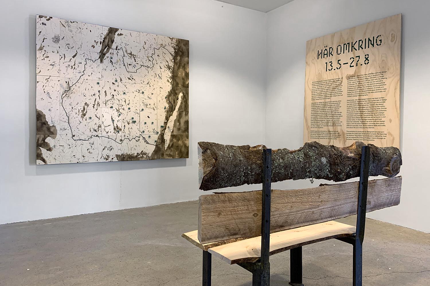
Map to Re-Learning the Archive
Re-Learning the Archive is a development project with the ambition to expand the Nybro design archive with alternative design histories.
I have created a map that brings together the active sites for design included in the project.
The map was made during a residency at Lessebo Handpappersbruk.
The paper used for the map was produced by the papermakers at the mill, using pulp containing leaves and soil from the Småland forest.
Instead of navigating by major man-made roads, lakes and waterways are what guide the way.
The map has travelled together with the exhibition ’Round Here—Local and Global Stories from Småland on the Nybro design archive and Form/Design Center in Malmö. Now it has found its permanent home at the Nybro design archive.
![bild]()
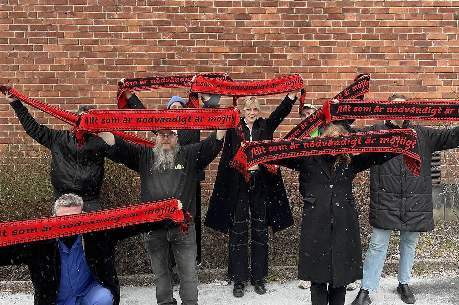
Supporter scarf for Hägerstensåsens medborgarhus
Part of an ongoing project focused on hand made signage in the house.
The quote Everything that is necessary is possible is borrowed from a small pamphlet on culture and popular education from 1908 that has inspired the work team.
The text is framed by a pattern from the house facade.
Photo: Sebastian Dahlqvist
![bild]()
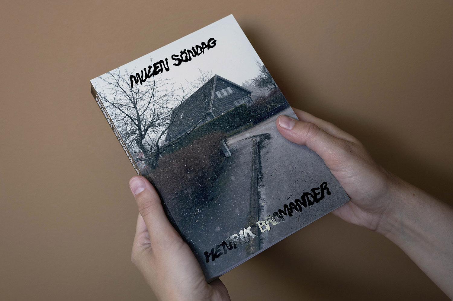
Mulen söndag
Book design of Henrik Bromanders Mulen söndag (Gloomy Sunday) that contains his early comic fanzines.
Cover photo: Per Englund. Published by Lystring förlag.
![bild]()
![bild]()
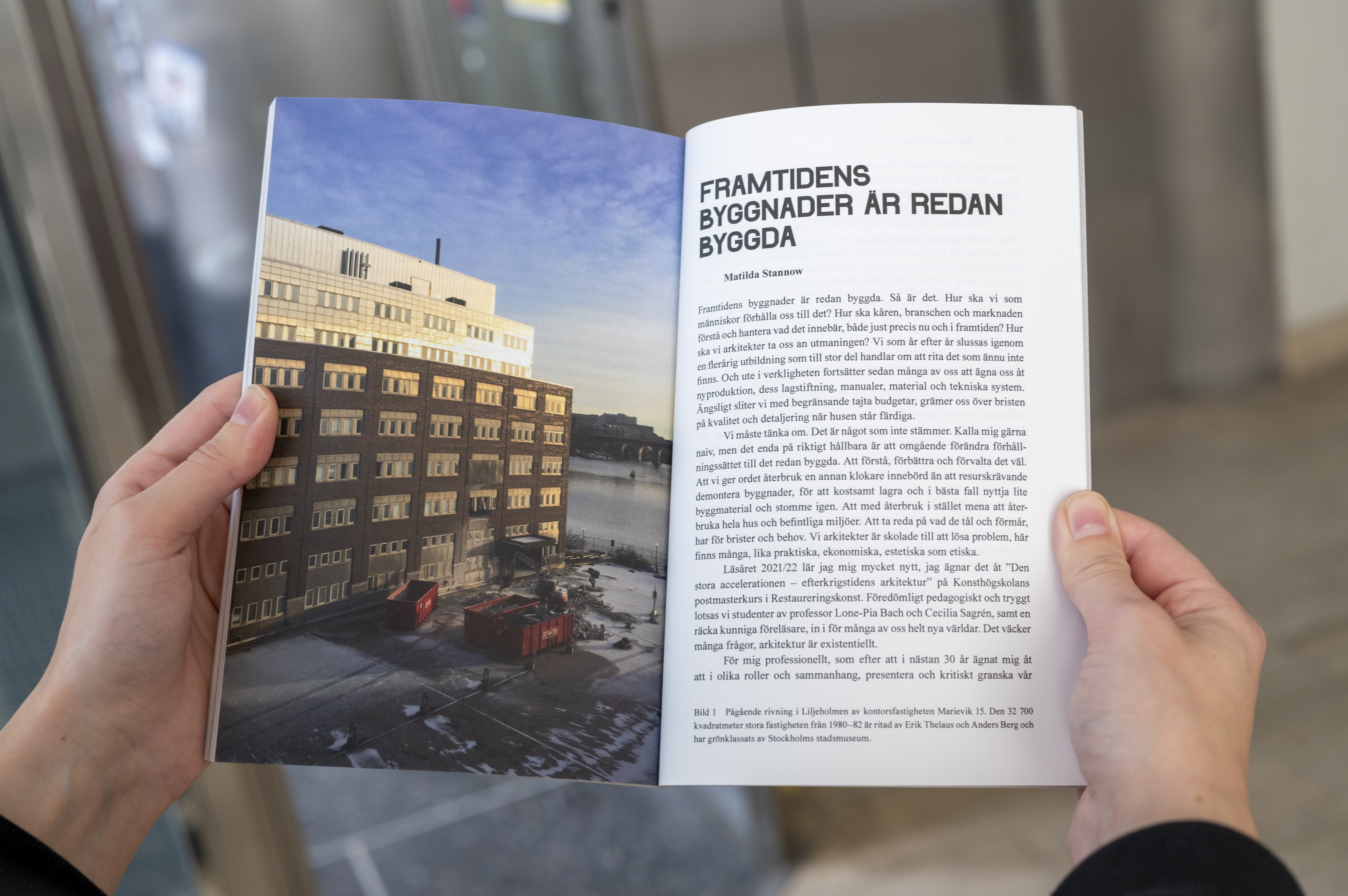
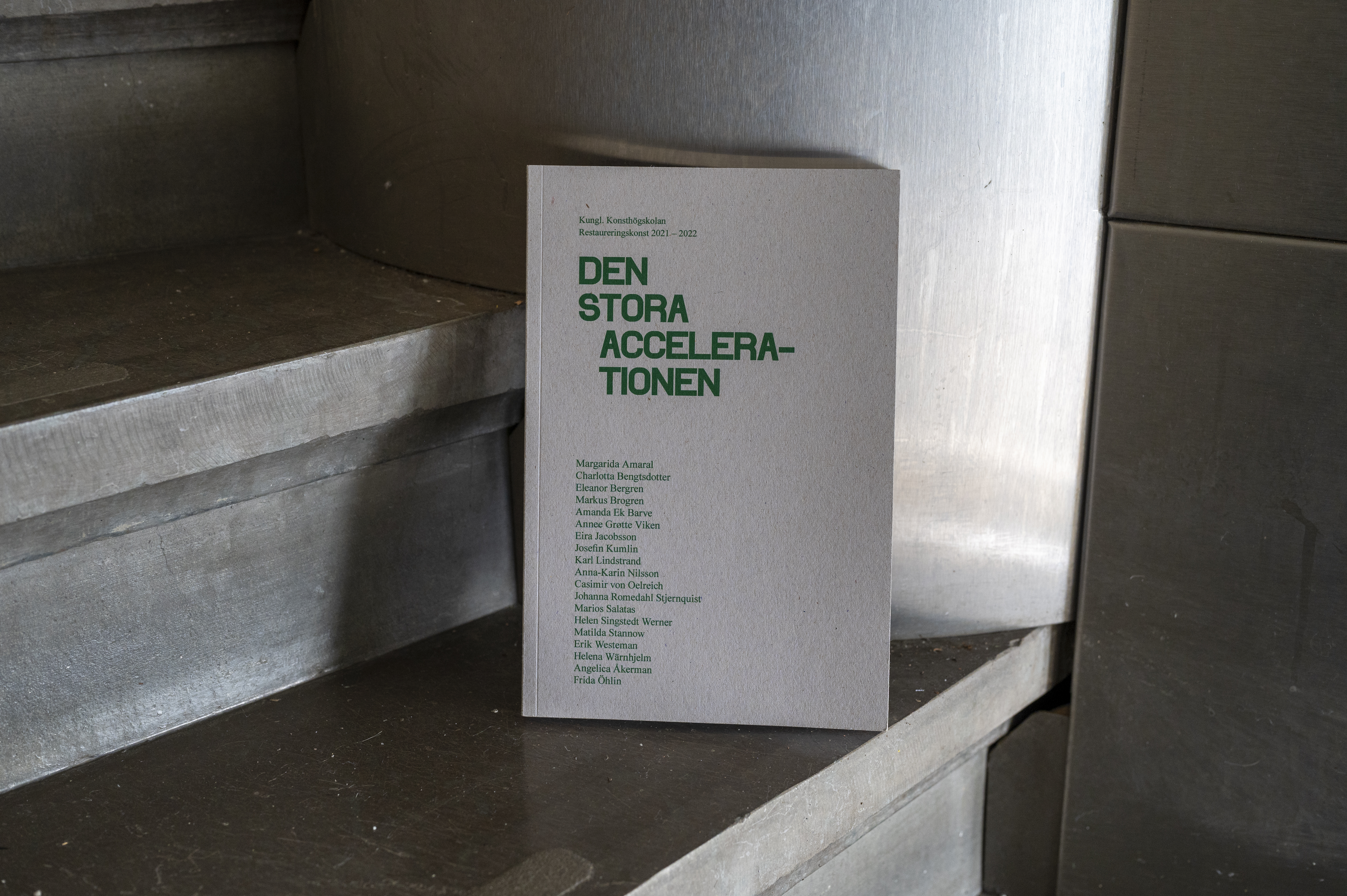
Publication template for the course Restaureringskonst at Swedish Royal Institute of Art
The goals of the template is small environmental impact, easy to work with and has hopes of fitting a lot of different student works.
The carton on the cover will be worn down by time, which gives every sample of the book its own traceable life and history.
Layout by the students of the course Den stora accelerationen, 2021-2022.
![bild]()
![bild]()
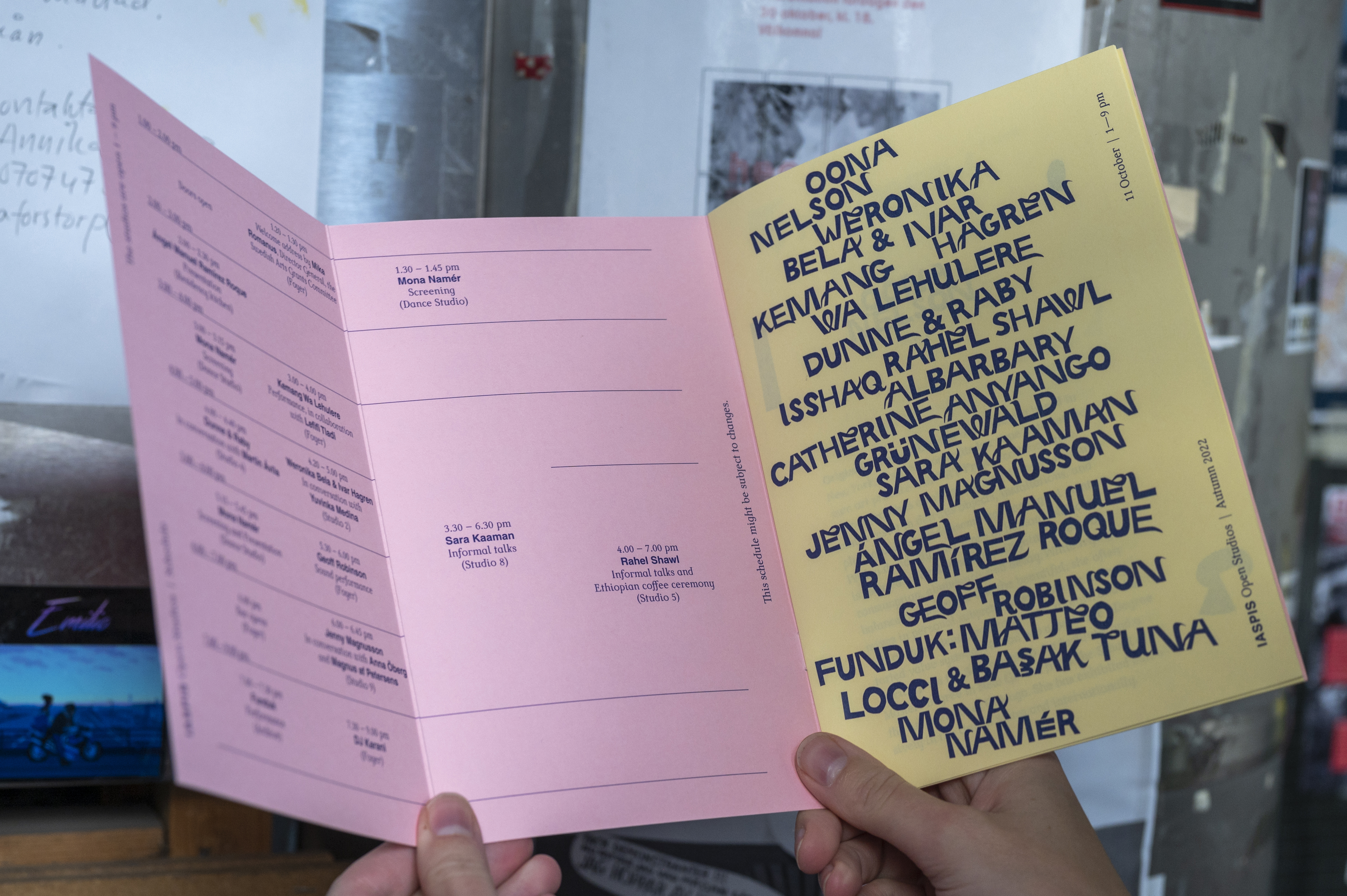
Folder for Iaspis Open Studios Autumn 2022
Event folder for Iaspis Open Studios. For this folder I made a font with cut outs, and the scraps are used as decoration. Printed in Colorit Pink 160 gsm and Charmonaix 80 gsm at TMG.
![bild]()
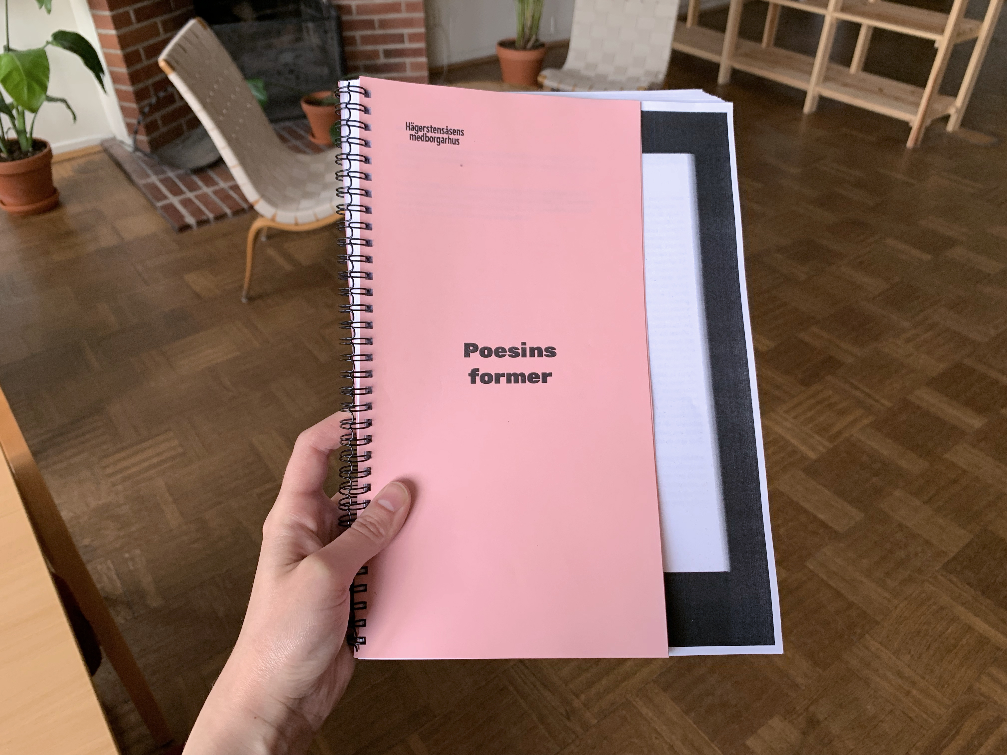
Readers for popular education groups at Hägerstensåsens Medborgarhus
Design templates for readers for popular education study circles at Hägerstensåsens Medborgarhuset. The cover and chapter page are smaller than the material they contain and have a similar function as a bookmark marking new chapters, but also makes it possible to glimpse the material about to be studied.
![bild]()
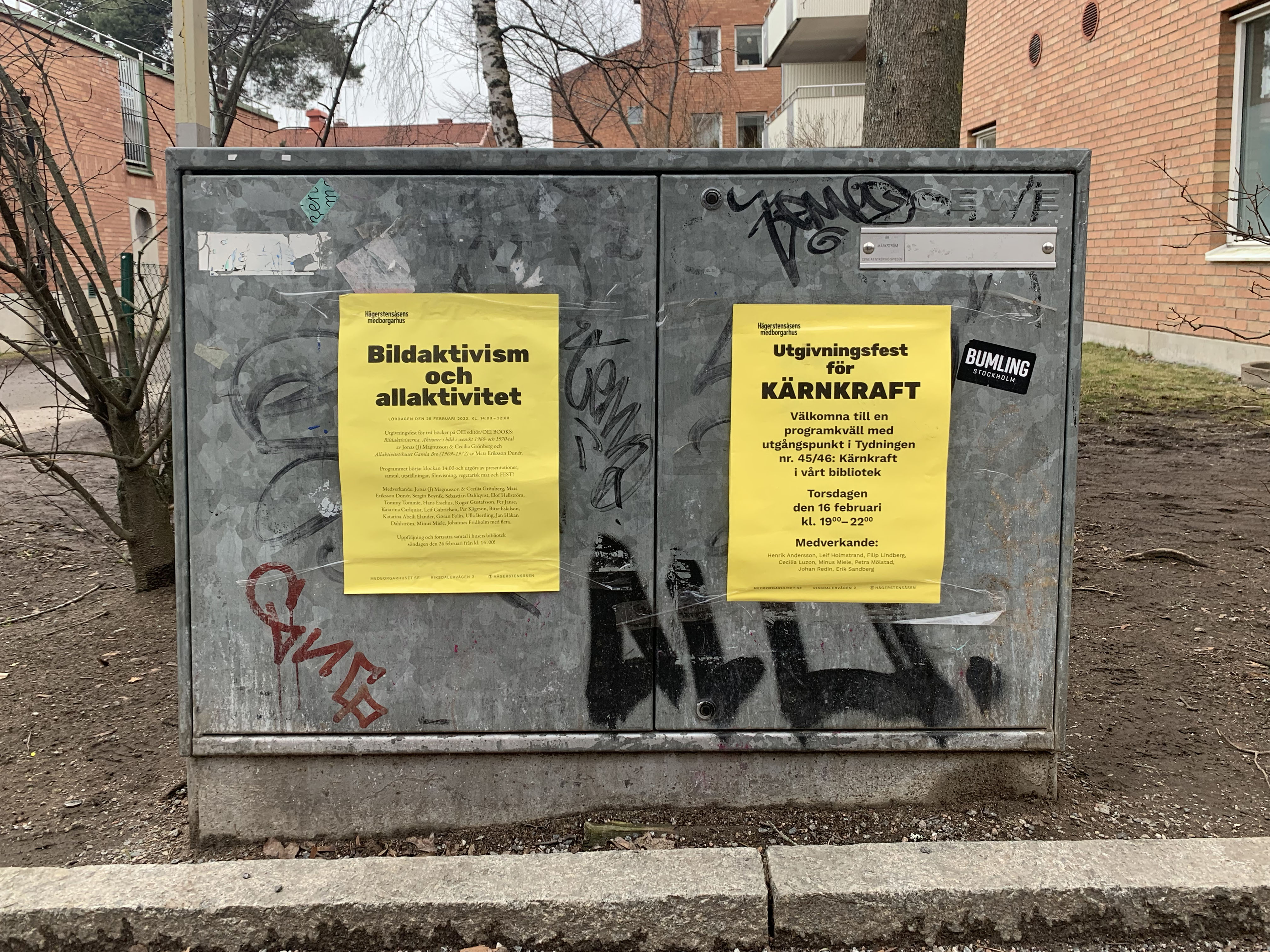
Poster template for Hägerstensåsens medborgarhus
An ongoing work where the template is adapted after the needs of the house in conversation with the house working team through talks and tests.
The aesthetic inspiration is from the workers- and peoples house movement, made in a format easy to print and to put up. The posters are made and printed by the house team, that fills the template with contents.
![bild]()
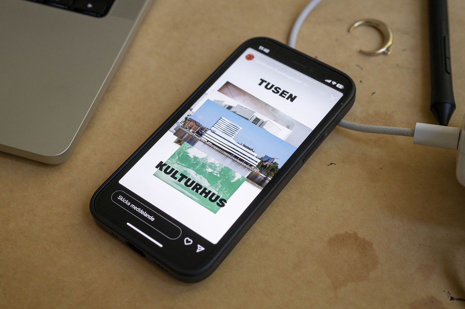
Tusen kulturhus
Graphic design for the course Tusen kulturhus (Thousand Social Centers), a post master course at Swedish Royal Institute of Art.
On social media different social centers was going to be presented with image and text. To show the quantity of houses, I chose to leave the images showed before tiled up behind the current image.
![bild]()
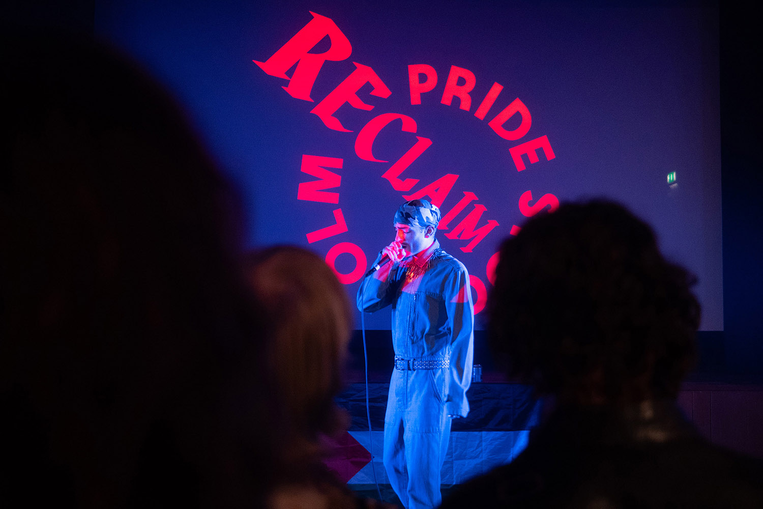
Logotype for Reclaim Pride Stockholm
I make design for several non-profit organisations. Here is a logo for Reclaim Pride Stockholm to their pre-pride event week at Hägerstensåsens medborgarhus during summer 2024.
Photo: Ilari Leskinen
![bild]()
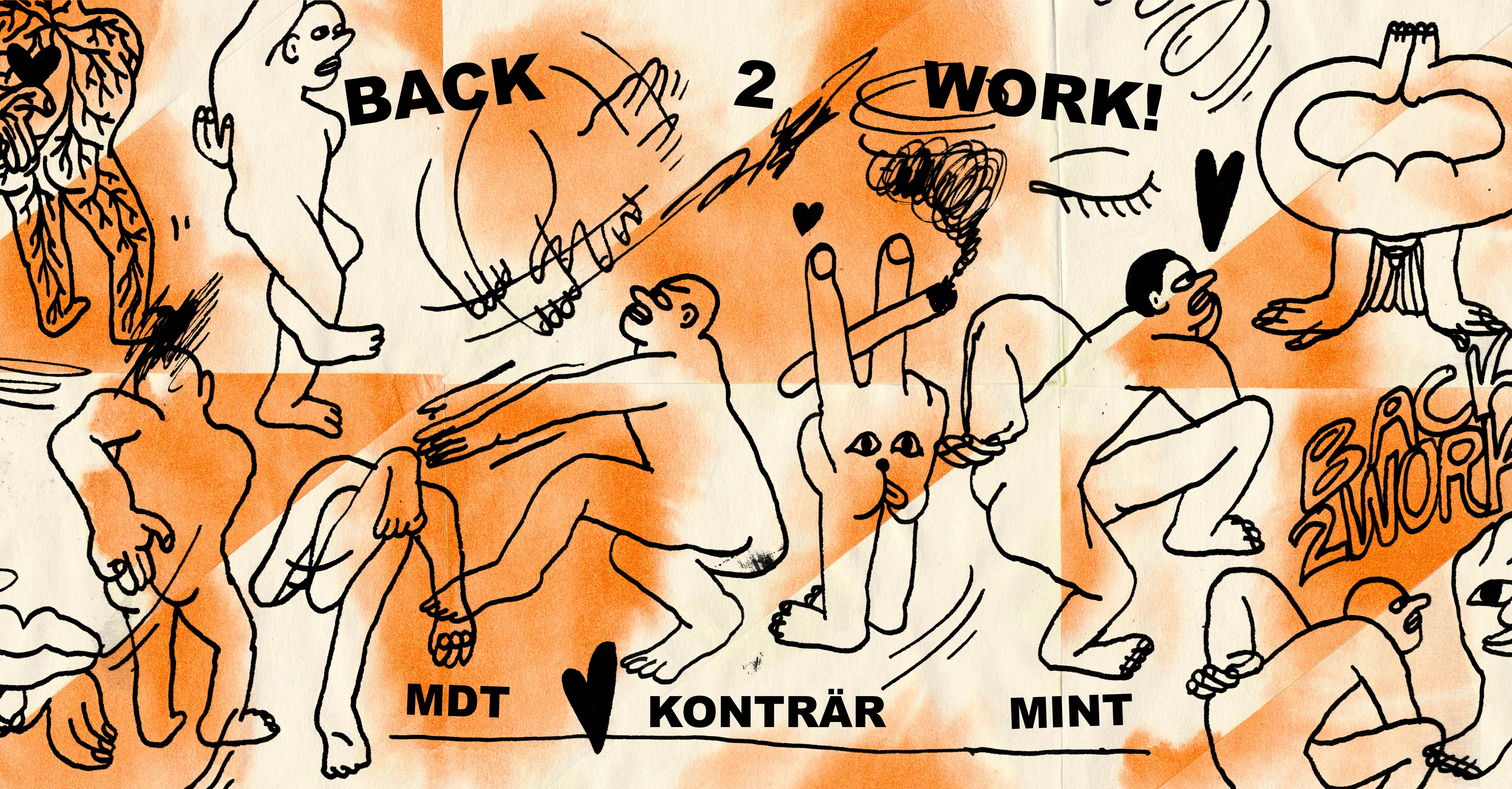
Graphic design for workshopseries Back2Work!
Inspired by the tactility of performing arts and the sketch-like and allowing structure of the workshop and mixed feelings one can have for being back to work. Collage, liquid ink on mulberry paper.
![bild]()
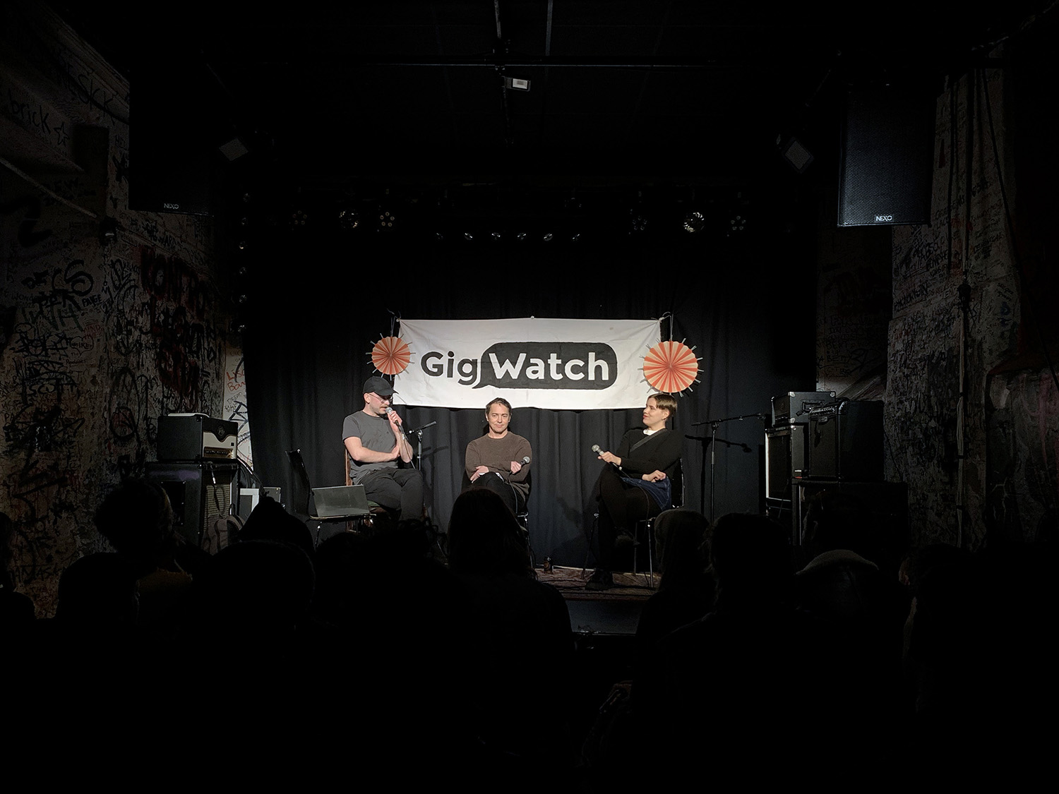
Logotype for GigWatch
A logotype for GigWatch, a non-profit organization working with observing, questioning and challenging the gig economy in Sweden. Read more about their work at gigwatch.se. The banner is painted by GigWatch and the photo is taken during a live podd event att Kafé 44.
![bild]()
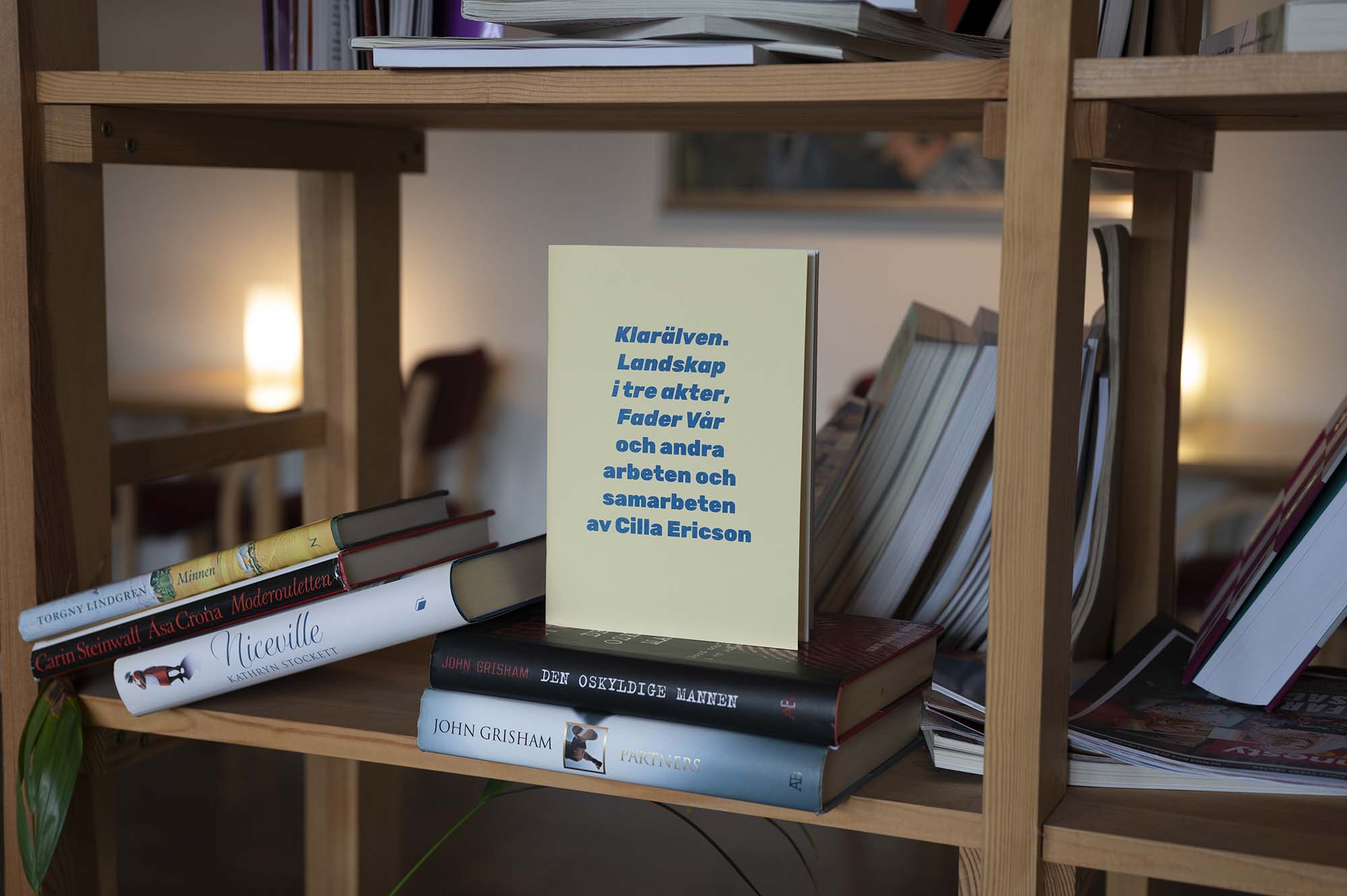
Series of publications for OEI Editör and Förlaget Damm
Riso printed publication series. On the photo: Klarälven. Landskap i tre akter, Fader vår och andra arbeten och samarbeten av Cilla Ericson.
Back to the top